March 19, 2014

MFT Wednesday Stamp Club


Hello!  It's Wednesday, and that means it's time for another fun sketch challenge from MFT!  Here's a look at the sketch:


I am smitten by this sketch!  I love the open circle and how the banner helps a sentiment take center stage.


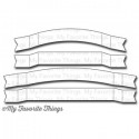
I'm using a sentiment from LJD Pretty Poppies, which sits so pretty on a Dimensional Banners Die-namics.  I stamped the sentiment in Blu Raspberry Ink and then used some foam tape (double thick) to pop that banner up.  I did a little background stamping with the Typewriter Text Background and the herringbone image from LJD Textile Backgrounds in Grout Gray Ink.  I added a big Orange Fizz Button for an explosion of color.


Be sure to stop by the MFT Blog for all the details on how you can win some MFT goodies!

You can find these fabulous items waiting for you in the MFT Boutique:

Thanks so much for stopping by!


recipe -
stamps: ljd pretty poppies (mft), typewriter text background (mft), ljd textile backgrounds (mft) 
paper: smooth white (mft), grout gray (mft), insulation pink (mft), blu raspberry (mft)
ink: grout gray (mft), blu raspberry (mft)
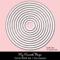
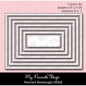
accessories: dimensional banners die-namics (mft), circle stax 1&2 die-namics (mft), pierced rectangle die-namics (mft), orange fizz buttons (mft), white perle thread, foam tape

March 17, 2014

Love Story

Good morning! I'm a little bit out of my comfort zone today - one layer card alert!!  This card is my first single layer card and, well, it's growing on me.  I'm taking Clean & Simple Stamping 3: One Layer Cards from Online Card Classes, and this card is pretty much a CASE of one of Laura Bassen's sample cards.  It's how I roll. Copy people until I'm ready to jump out of the nest.


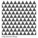
I started with a Smooth White Card Stock A2 card, folded so that it opens to the side.  I inked up my Patterned Triangles Background in Grout Gray Ink and stamped it right on the card front.  I actually place the stamp face up on my work space and then lay the card down on top of, using my hands to press the ink onto the paper (place a sheet of computer paper over the top of the card stock to keep your hands nice and clean and pretty).  Next I added the 2 larger brush stroke images from Jumbo Abstract Art to make a nice background to my sentiment.  I overlapped the images just a bit so that the sentiment from Love Story would peek just over the top and bottom of the Berrylicious background.  After letting the paper dry for a moment, I stamped the sentiment in Black Licorice Ink and then added various ink splatter images from Abstract Art around the edges of the card, with a few strays toward the center.  There you have it. 


I will definitely be trying more one layer cards - I need to get much faster at it too!  Here are all the products I used on this card today:


Thanks so much for stopping by!


recipe -
stamps: love story (mft), jumbo abstract art (mft), abstract art (mft), patterned triangles background (mft)
paper: smooth white (mft)
ink: grout gray (mft), black licorice (mft), razzle berry (mft), cotton candy (mft), sour apple  (mft), berrylicious (mft)

March 16, 2014

Sweet Sunday Sketch Challenge 211

Good morning!!  It's time for another Sweet Sunday Sketch Challenge!  Want to play along?  Here is the deal: make a card with this layout and use the InLinkz button down at the very end of this post to enter your card. The links will close on Friday at 10 PM (Mountain Time). Be sure to link directly to the blog post or gallery image which features your card. You may post a picture of the sketch on your blog, but please save the image to your computer first. Use the keyword SSSC211 if you plan to post your card in an online gallery.


Hey, lookie!  I made a card for my own challenge this week!  Hardy-har-har!!  Sorry about last week; things just kept piling up and I just couldn't find a good time to stamp.  Speaking of stamping - I didn't stamp a bit on this card today.  That seems weird to me, but I loved the way it was with all the die cuts.


I saw Color Throwdown's CTD283 and I thought it was a really interesting color combo, and since it is a masculine color palette, I kept it pretty clean.  Although I did use glitter paper...  Anyway.  Since the sentiment is front and center, I'll start there.  I cut out the swirly hello (yep, screams masculine, right?  What am I thinking?) from Happy Hellos Die-namics in gray glitter paper and then cut it out again in Sweet Tooth Card Stock so I could place the glittered sentiment right inside the white paper.  I added all the little loopy insides back into the die cut as well.  Don't lose those little pieces.  I embossed the background with the On the Diagonal Stencil and then used a Stitched Circle STAX Die-namics in Tangy Orange for the accent circle.  I bent the rules a little by adding a trio of scattered green sequins (again, super masculine) in the corners.


Well, that's it for me.  I hope you will hop around to the Sweet Sunday Stampers' blogs to see what they've created for you this week:

And you can find these fabulous items waiting for you in the MFT Boutique:


Thanks so much for stopping by!


recipe -
paper: sweet tooth (mft), steel grey (mft), tangy orange (mft), sour apple (mft), glitter paper
accessories: happy hellos die-namics (mft), stitched circle stax die-namics (mft), on the diagonal stencil (mft), lucky blend sequins (avery elle), die-namics embossing pad, foam tape


March 14, 2014

Thanks So Very Much


Good morning!  I hope you are having a fabulous week.  I was inspired by this week's ColourQ Challenge and had some extra time to stamp the other day.  I just ordered some stamps from Verve and couldn't wait to get them all inky.  These little Loopy Blooms look like little clovers to me, so I thought they would look pretty cute for this St. Patrick's Day themed color challenge.  I cut out the Rounded Scallop Frame in black and white card stock and then used the alphabet border in Take Note to mimic the newsprint part of the color challenge.  I didn't have any newsprint, and didn't want to cut up a book, so this was a fun solution.  The sentiment in the lower right corner is from Making a Statement.  For a little extra detail, I added a few black pearls to the clovers.


Here are the Verve products I used on my card today:


Thanks so much for stopping by!


recipe -
stamps: making a statement (verve), take note (verve)
paper: smooth white (mft), kraft (mft), black licorice (mft), gumdrop green (mft), sour apple (mft)
ink: black licorice (mft)
accessories: loopy blooms die set (verve), rounded scallop frame die (verve), corner rounder, black pearls (kaisercraft), foam tape